Why Comic Book Lettering Is an Art Form You Shouldn’t Ignore
Most comic fans remember the art first. The splash page, the dynamic pose, the ink lines that give a hero life. But what about the words? Imagine reading a scene where a character whispers, but the balloon is huge and bold. Or a fight scene where the sound effects feel flat and small. Something would feel off, even if you couldn’t name it. That’s the quiet power of lettering. It’s the voice of the story, and when done right, you don’t notice it at all. When done wrong, you can’t ignore it. Lettering is not just typing words into balloons. It’s a craft that blends typography, pacing, and emotion into one seamless experience. And in 2026, more creators and readers are starting to treat it as the art form it always was.
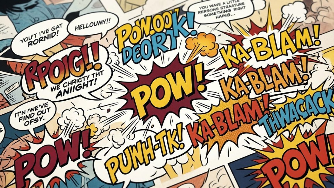
Comic book lettering is a narrative tool that controls pacing, conveys emotion, and builds atmosphere. From balloon placement to sound effect design, every choice a letterer makes affects how you read and feel the story. Recognizing this craft will deepen your appreciation for the entire comic-making process.
The Voice You Didn’t Know You Were Hearing
When you open a comic, your eyes do a specific dance. They scan the page, follow the panels, and read the words. The letterer choreographs that dance. They decide where your gaze goes first, how long you pause, and which words hit you with force. This is no small task.
Think about a whispered line in a tense scene. The letterer might shrink the font size, add extra space between letters, or use a thin balloon with a jagged tail. That tells your brain “quiet” before you even read the words. On the other hand, a shouted line might get bold, uppercase letters, a thick balloon, and a burst shape. You feel the volume instantly.
Good lettering is invisible. It serves the story so well that you never stop to think about it. But when you start looking, you see the artistry everywhere.
What Makes Comic Lettering an Art Form?
Lettering is more than handwriting or picking a font. It’s a combination of several disciplines:
- Typography: Choosing the right letter shapes, spacing, and size for readability and mood.
- Page composition: Placing word balloons and captions so they guide the eye naturally across the panel.
- Sound effects (SFX): Designing words that explode, hiss, or whisper as visual elements.
- Emotional nuance: Adjusting weight, italics, and balloon shapes to match character tone.
Without lettering, the best art in the world can feel lifeless. With it, a quiet conversation becomes intimate, and a battle becomes chaotic. Let’s look at the specific tools a letterer uses.
The Letterer’s Toolkit: From Balloons to Sound Effects
Every letterer builds a page using a set of core elements. Here’s a breakdown of the main components and how they shape the reading experience.
| Element | Purpose | Common Mistake |
|---|---|---|
| Word balloon | Holds dialogue; tail points to speaker | Tail overlapping faces or key art |
| Caption box | Holds narration or internal thought | Using wrong font weight for tone |
| Sound effect (SFX) | Represents noise visually (CRASH, WHISPER) | Making it too small to read |
| Balloon shape | Indicates tone (jagged = anger, dotted = whisper, cloud = dream) | Using default shapes for all emotions |
| Leading & kerning | Spacing between lines and letters | Overcrowding text that hurts legibility |
The table above shows just a few examples, but the possibilities are endless. A letterer like Chris Eliopoulos or Clayton Cowles might spend hours adjusting a single balloon tail so it doesn’t cover a character’s eye. That attention to detail is what makes lettering an art.
“Lettering is the only part of comics that has to work every time. If a reader can’t read the words, nothing else matters.” — Todd Klein, Eisner Award-winning letterer
This quote from Todd Klein reminds us that lettering is the bridge between the visual and the verbal. If that bridge crumbles, the story falls apart.
Common Mistakes That Break the Reading Flow
Even experienced creators sometimes overlook lettering. Here are pitfalls that tank a comic’s readability:
- Inconsistent balloon sizes: Makes the page look messy and confuses the eye.
- Wrong font for genre: A horror comic shouldn’t use a bubbly, playful font.
- Ignoring balloon tails: A tail that points to empty space leaves readers guessing who spoke.
- Bad sound effect placement: SFX that overlap critical art can ruin a reveal.
- Tiny or huge lettering: Forces readers to squint or strain.
When you spot these issues, you realize how much craft goes into avoiding them. Next time you read a comic, take a moment to notice if any of these happen. If they don’t, thank the letterer.
How to Appreciate Great Lettering in Your Next Read
You don’t need to be a letterer to see the art. Here’s a simple process to train your eye:
- Pick a page with dialogue and action. Look at how balloons are stacked. Are they in reading order (top to bottom, left to right)? Does the eye move smoothly?
- Notice the sound effects. Are they integrated into the art? Do they have weight and texture? Or are they just typed words?
- Check the balloon shapes. Do they change with the emotion? Jagged for anger, wavy for confusion, floaty for dream sequences?
- Read aloud. Does the pacing match the intended rhythm? Short bursts for action, longer lines for reflection.
This exercise will open your eyes to the invisible work behind every page. You can also compare different letterers to see how their styles vary. For example, compare a modern comic like Saga (lettered by Fonografiks) with a classic like Watchmen (lettered by Dave Gibbons). Each brings a distinct voice.
If you’re new to comics and want to discover the most anticipated upcoming comics of the year, look for titles that highlight strong lettering. Many indie publishers now include lettering notes in their credits, showing how much they value the craft.
Your First Steps Into Lettering
Maybe you’re an aspiring artist or writer who wants to try lettering yourself. You don’t need expensive tools to start. Here’s what to do:
- Practice with a brush pen or digital tool like Procreate. Focus on consistency: same letter height, same slant.
- Study fonts. Learn the difference between a serif and a sans serif, and when each works best.
- Read lettering tutorials by professionals. Many comic letterers share their process online.
- Start with a short, silent comic. Add lettering to a wordless story to focus on pacing and placement.
Mastering lettering takes time, but the payoff is huge. Your comics will feel more professional, and readers will thank you for a smooth experience.
The Unsung Heroes of the Page
Letterers rarely get the spotlight. Their names appear in small type in the credits, while artists and writers grab the covers. But in 2026, that’s starting to change. Conventions now host lettering panels. Online courses teach the craft. Fans share side-by-side comparisons of bad vs. good lettering on social media. The community is waking up to the fact that lettering is not just a service job. It’s a creative role that shapes the final product.
Supporting this growing awareness, the rise of independent comics has given more freedom to letterers. Exploring the evolution of indie comics and what it means for fans reveals that many indie creators handle their own lettering, bringing a raw, personal touch that mainstream books sometimes lack. This DIY spirit adds character and authenticity.
Even collectors are starting to pay attention. How collectors are shaping the future of comic book markets shows that variant covers and original art pages are highly sought after. But original lettering pages? They’re becoming collectible too, especially when the letterer is a known name.
The Sound of Silence: Lettering’s Role in Quiet Moments
Not all lettering is loud. Some of the best work happens in silence. When a character thinks, the letterer might use an italic, smaller font inside a floating cloud. When time passes slowly, captions might have wide leading and a pale tint. These subtle cues tell your brain “slow down, this matters.”
Contrast that with a frantic fight scene. The balloons overlap. The sound effects are huge and angled. The font is tight and bold. Your eyes race. The letterer controls that speed.
This is the heart of the art form: lettering is a direct channel to the reader’s subconscious. It bypasses the conscious mind and speaks straight to emotion. Once you see it, you can’t unsee it.
The Future of Comic Lettering in 2026
Digital tools have made lettering more accessible than ever. Programs like Adobe InDesign, Clip Studio Paint, and even free apps like Blambot’s Comic Fonts let anyone try. But accessibility doesn’t replace craft. The best letterers still spend hours on every page, adjusting spacing, kerning, and balloon shapes by hand.
As comics move further into digital and vertical scrolling formats (like Webtoons), lettering must adapt. Vertical panels change how the eye moves. The letterer’s job becomes even more important in guiding readers down the screen. It’s a new frontier, and the same principles apply: clarity, pacing, and emotion.
We’re also seeing a resurgence in hand-lettered comics. Artists like Jillian Tamaki and Kyle Starks put their own handwriting into the pages, giving a unique, personal feel. That rawness connects with readers on a deeper level, showing that lettering is not just a technical skill but a personal voice.
If you want to see how animation and comics intersect in lettering style, check out our top 10 upcoming animated series fans should watch in 2026. Many of those shows use comic-style lettering in their title sequences, proving that the art form has influence beyond the page.
Your Turn to Listen
Next time you pick up a comic, stop before you read the first word. Look at the letters. Notice the balloons. Think about why the letterer placed them there. You might find a new layer of storytelling you never noticed before. And maybe, just maybe, you’ll want to try it yourself. Pick up a brush, open a digital canvas, and start shaping the voice of your own story. The letters are waiting.